Welcome to my blog and thanks for reading. I post as often as I can listing upcoming events, interesting projects I am working on and some tips or two on using my favourite material - clay! If there is something you would like me to blog about, please send me a note. Please visit my website for more images of my work and an updated listing of events and happenings - http://www.taralynnefranco.com/


Monday, December 8, 2008

Holiday Sales Continue through to Christmas

Thank you to all that came out to my Holiday Open House and Sale. It was a great weekend, a chance to reconnect with friends and share some holiday cheer and help people find the perfect handmade gifts for friends, colleagues and loved ones. My studio will be open up until Christmas for sales and I will be hard at work in the studio finishing up some orders and making work for my show at the Katherine Butler Gallery in Sarasota Florida that starts on January 14, 2009. Merry Christmas, Happy Holidays and the best of the season to all of you.
Tara

Tuesday, December 2, 2008

Open House Starting This Friday December 5th to 7th

The shelves are stacked and the final firings are underway to prepare for this weekend's open house. All that is left is a bit more firing, some cleaning and of course a whole lot of baking so visitors can enjoy some delicious goodies while browsing. I am really excited as I have some new designs in my functional line as well as new pendants. And of course, in time for the holidays I have some beautiful holiday ornaments that are wrapped and ready for hostess gifts or stocking stuffers. I hope you can stop by to my home and studio - 135 Kent Street Hamilton. For a link to a map, please see my website at http://www.taralynnefranco.com/

The times are:
Friday December 5th - 4pm -8pm
Saturday December 6th - 10am - 4pm
Sunday December 7th - 10am - 4pm

On a personal note, today is my grandma Pasqualina Franco's 110th birthday. Yes, she was born on December 2nd, 1898. We celebrated with her this past weekend. This is my sister Nycole (left) and I with Gram. I had just told her something and just before Robert snapped the picure she looked at me to respond. Is she cute or what?

Thursday, November 6, 2008

The Holiday Sale Season Begins

Have you noticed any changes at your local stores as yet? You know the holiday season is coming along quickly when the day after Halloween the orange and black are removed and the red and green make their appearance. That day, even at Fortinos, our local grocery store which is owned by Loblaws the cashiers were wearing holiday shirts advertising that PC has released new products for the holidays. The cashier and I had a laugh over that when she told me that she wore her costume to work the day previous and then arrived at work that day to be presented with her new holiday shirt.
Well the same is true for the art and craft scene. This week I have 3 openings and 2 sales events. Tuesday was the launch of the Hands on History Tile at the Gardiner Museum which was fantastic. I loved seeing the other 7 interpretations of Ontario's archival heritage. Last night was the VIP preview night for the Art Gallery of Hamilton's Art Sale that I have pieces in (see http://www.artgalleryofhamilton.com/as_shop_art_sale.php) which will continue over the weekend. Friday is the opening for Designer Craft at the Carnegie Gallery as a part of Arts Dundas (see http://www.carnegiegallery.org/ArtsDundas/ArtsDundas2008/events.htm). The photo is the piece I have in this exhibition. And this weekend I, along with 113 other potters will have our work for sale at the Fall Sale of the Potters' Guild of Hamilton and Region at the Dundas Community Centre. And then it continues from there culminating in my own Holiday Open House and Sale December 5th to 7th. With that, I will return to the studio to keep making ....

Thursday, October 23, 2008

Tara CAN Read

As you may have noticed in the bottom right corner of my blog, I have been posting reviews of Canadian fiction I have been reading as part of the "Great Canadian Book Challenge Eh!". This section was getting a bit long, and I felt that I wanted to write more about these fantastic books, so I have started my second blog dedicated solely to my reading habit called Tara CAN Read - the "CAN" being the Canadian part .... So, I will soon be transferring over my reviews which will become more detailed over to this new site - http://www.taracanread.blogspot.com/. I hope you will drop in and visit and offer your thoughts on these books or suggest some of your own. I just finished "King Leary" by Paul Quarrington and have just begun "Not Wanted on the Voyage" by Timothy Findley.

Wednesday, October 22, 2008

Strange Closets

A while back when I was looking for images of pitchers to share with my pottery class I stumbled upon a fantastic blog called "Strange Closets" by Tate Gunnerson, a freelance writer from Chicago with a passion for design - http://www.strangeclosets.com/. This blog is a treasure-trove of all things design. I emailed Tate and he posted a profile of my work earlier this month. Click on the title of this blog entry to link to this section of his blog.

Sunday, October 19, 2008

Beyond the Valley Studio Tour

I just returned home from a sucessful weekend as a guest at Richard Fisher's studio for the Beyond the Valley Studio Tour. It was great to see so many people out on such a lovely weekend and also see that the looming recession in the US (and in Canada as some fear) did not prevent people from purchasing handmade items from the artists on the tour. I was fortunate to have a feature photo in the Hamilton Spectator this week which resulted in a number of people coming to see my Spider Chrysanthemum wall piece. I had two available and both went to great homes within 5 minutes of eachother. Next stop in the fall season ... the Fall Guild Sale November 7-9th (see http://www.hamiltonpotters.ca/) and then my Holiday Open House and Sale here at my studio December 5th to 7th. See my website at http://www.taralynnefranco.com/ for details. I will be making some of the old favourites as well as new pieces perfect for holiday gift-giving and continuing to develop my line of pendants which I will also have for sale.

Monday, October 6, 2008

Trust Your Cape

This weekend I participated in an inspiring workshop given by Tony Clennell called "Lipstick on a Pig". We have all done it ... looked for that ultimate glaze that would "make" our pots and have possibly fell victim to loving a piece of ours or someone else's because of a sexy glaze, particularly when we were first exposed to pottery/ceramics. The purpose of this workshop was to go beyond this and look at the form which defines the true difference between pedestrian work and truly great work. Tony has achieved this and yet continues to see his glass half full, constantly re-examining his work which continues to improve as he works towards his Masters degree from Utah State. Tony demonstrated pieces throughout the 2-day workshop but this was only as a starting point to discussion about why we do what we do. Tony is a fantastic teacher - able to push the right buttons, get you thinking about your own work and how you might make it better. He has a great way of communicating with people that helps you understand what he is trying to get at. My favourite sayings from the weekend were "farting in a bathtub", finding your "Alaska" and "trusting your cape". We discussed, we had some hands on activities to do and the weekend ended with a critique of our favourite pots - either our own or others - which was done as a group. This was an interesting part of the workshop and something that could be repeated. Why shouldn't we get together in small groups for critique and suggestions... It will only make our work better. It is often easier for someone who is not as close to work to see other things that could be done and when necessary call your bluff ... I love this piece of Tony's ... mmmm gnar, gnar!

The final piece

You asked for it and here it is. My final piece for the Hands on History tile. I apologise for the quality of the photo of it which was taken on my floor and is really yellow. The piece was completed and then delivered the following day. It will be professionally photographed and I will have that photo at some point. The piece will be on display for one day only at the Gardiner Museum of Ceramics in Toronto on November 4th. Time TBA.

Sunday, September 28, 2008

New Website - www.taralynnefranco.com

It is official ... I have registered my domain name and now am the proud owner of www.taralynnefranco.com. I have put a basic website up using the software provided by godaddy.com which for some reason won't link from this blog - very strange. Have a peek and let me know what you think. Cheers

Friday, September 26, 2008

New Designs for Fall

It is fall and I am officially back in the studio and excited to get working on new pieces and new designs as well as old favourites. I will be working with black clay and white slip testing a new series starting with mugs. I am also launching my new line of pendants that are made with 3 types of clay that are marbled, cut, stretched and polished, finished with a stirling silver findings and chains. Some of these new pendants along with my white porcelain ones will be at the Art Gallery of Ontario when they re-open in November as well as through my studio and a few other retail outlets.

Wednesday, September 24, 2008

Stephen Harper ... "ordinary people don't support the arts" and neither does he

It was easy to figure out the theme of my first blog post completion of my tile. It came to me sometime yesterday when I first heard a sound bite of Stephen Harper in Saskatchewan yesterday describing artists as the "social elite" subsidized by taxpayers dollars. He was defending his announced cuts in arts spending and said "I think when ordinary people come home, turn on the TV and see a gala of a bunch of people ... at a rich gala all subsidized by taxpayers claiming their subsidies aren't high enough ... I'm not sure that's something that resonates with ordinary people". Hmmm ... I am not sure what arts "galas" he is referring to, but I can assure Mr. Harper that artist are not the social elite, they are some of the lowest income earning individuals and that they, and the people who enjoy their art be it visual, performance or otherwise, are also "ordinary people". I agree that we cannot live beyond our means, but come on ... what is he thinking. Perhaps in a year there are one or two galas as the one he is describing and guess what, the rich people that are attending it are not the artist, they are the people that come out to these events and support the artists by just being there, and with luck, buying their work. Many artists who are self-supporting have to work multiple jobs in order to make ends meet. Harper went on to talk about how they they are "listening to ordinary people ... not people who work in ivory towers, but people who actually work on the street". Funny, I don't know any artists or arts organizations who live in ivory towers ... perhaps he is confused and is thinking about his friends in the corporate world who he would rather support. And just to set the record straight regarding his comments that funding to Canadian Heritage has gone up 8%, this department does more than fund the arts. According to the Ontario Crafts Council, the Conservative government has chosen to cut 13.7 million in funding for the arts through the Canadian Heritage and the Department of Foreign Affairs and International Trade. These cuts, mainly to curb spending on international touring and travel of Canadian art and artists in all disciplines, including visual arts and fine craft, affect the entire cultural sector. George Stroumboulopoulis had a great rant on this subject on his show last night. If there was any question in my mind about who I am voting for, I can tell you for sure now, who I am not going to be supporting.

Tuesday, September 23, 2008

Mission Accomplished!

Yes .... my Hands on History "tile", which still needs a title, is finally complete and delivered as of 10:30am this morning. What a thrill to be finished this commission that has consumed my mind, my creativity and my time for what seems like a very long time. It was definitely a worthwhile venture as it had me stretch my creative and technical muscles. I had a bit of performance anxiety getting started ... but once I started the assembling process I was able to get on a roll. It did however take many, many hours to glaze the pieces as this was new territory for me with so many different shapes and elements to work with - some with image transfer, some with decals, and then tons of different textured pieces in various sizes and shapes in both porcelain and white earthenware. I don't want to give away what the final piece looks like (there is a one day opening on November 4th at the Gardiner Museum of Ceramics in Toronto which all are invited to), but here is one last process photo of the frames with the grey underglaze. I didn't end up using the pieces I had put underglaze colour on, so despite thinking I had way too many pieces to work with, I didn't have THAT many. I am very pleased with the result despite some technical problems with the firing of the pieces that required some creative repair work, that in the end, improved the pieces .... necessity IS the mother of invention I guess. Now I am back to work getting ready for my busy fall season. Now that this is done, what should I write about????? Suggestions???

Thursday, September 18, 2008

Yes, I made enough

Once I unloaded yesterday's bisque and saw what I had, I realized that I did in fact make enough "parts" - probably enough to make 3 x what I need to make. The extras will be interesting to add to other pieces in the future, just as I have slipped in pieces from another special piece into some of my regular work. Here is funny little video complete with my commentary of my work in progress. After tonight's cone 6, two more firings to go and I will be finished.

Wednesday, September 17, 2008

countdown ... the final firings

I have finished making all the "parts" of the tile and am just waiting for the kiln to cool so I can unload it and then bisque fire the last set of parts and frames. I wonder if I made enough parts, however there comes a time when one just needs to move on, so I will have to wait and see. Next it will be glazing and firing the cone 6 parts and finally assembling all the pieces together and firing the final tile components to 04. My emotions are mixed from a bit of worry - how will they work out, will they crack, will I have enough parts - to the excitement of seeing the final product and seeing if there is something in there that I can use to enhance my work - and of course relief, that it will finally be done. I have missed working on my regular work and am anxious to do that and get my inventory up for orders and for the fall holiday season.

Monday, September 15, 2008

Guelph Pottery Festival - The Five Pound Flower Challenge

I spent this past weekend in Guelph at the Arboretum for the Pottery and Sculpture Festival. It was great to reconnect with friends in the ceramics community that I only see at these types of events. Organized by Bunny Safari, this event included the Pottery Olympics featuring events such as the tallest 5lb cylinder, longest pulled handle, most voluptuous pot thrown blindfolded with prizes donated by Tucker's Pottery Supplies. I couldn't get anyone to do a hand-building challenge with me, so one of the potters challenged me to make a 5lb flower out of paper clay. And here it is. I have also just joined the 2nd Canadian Book Challenge Eh! You can follow my progress and my reads on this blog.

Tuesday, September 9, 2008

The deadline approaches ....

I have been working away on my Hands on History tile and now have all 8 "frames" (plus a second set of 8 back-ups) built and drying. I made patterns for each of the frames using roofing paper to allow me to build them from wet slabs of clay as opposed to waiting for the clay to become leather-hard. This photo shows the roofing paper on top of a large slab waiting to to be cut and assembled and the second photo shows an assembled frame as well as some sides of a frame mitre cut and ready to be assembled. Today I will shift my focus towards continuing to make all of the "parts" - those elements inspired by the holdings of the Archives on the Bertram family. These textures and images will complete the final pieces. It has been an interesting and educational journey, from the research, the testing and finally the making. I am looking forward to seeing the final product and how this idea is ultimately transformed in the kiln.

Wednesday, September 3, 2008

A morning at the Museum

Today I visited the Dundas Museum and Archives with clay and plastic wrap in hand. The purpose of today's visit was to take clay pressings of the collection of medals from the Bertram family. These pressings will become molds that I will use to create elements for the final tile. The Museum has a great collection medals the family received including medals the Bertrams received from the Rose Society of Ontario for the beautiful rose garden they maintained at their home. The collection also includes the Order of Canada Medal received by Dr. John Bertram Stirling in 1969, numerous awards received by Henry Bertram from the Ontario Rifle Association and awards won at various agricultural fairs in Canada and as far as Paris France.
There were a few members of the Bertram family that served in WW1 and WW2, some of whom died in battle and their medals are carefully preserved in the Museum's collection.

Tuesday, September 2, 2008

Labour Day Testing

Labour day was truly a day of labour in the studio as I completed some paperwork and then set to work on the next series of tests. I finished my work day at about 10pm or so in the evening, loading up the kiln to bisque fire overnight. I decided to do a few more tests with what I have now discovered are "underglazes" rather than glazes, painting them on leather hard tiles and then placing the laser decals over them. I am trying to determine how I might incorporate some subtle colour into the final tile. I also spent some time later in the evening planning the layout of the "parts" of the final tile which will a series of "boxes" that will be approximately 30" x 30" when hung. I have been drawing these out for a while now in my sketchbook, trying to figure out the most desirable combination of sizes of boxes. I then used roofing paper to cut out the pattern to scale so I could examine it. This was my first attempt. I recall hearing a critique by Steven Heinemann that when making pots (or when looking at other people's work), sometimes you need to take the piece and turn it on its side or upside down and examine its new form. I photographed the first layout from above and then walked around and looked at it as if it was turned 90 degrees, photographed it again and found this was a more desirable layout. As I continued to look at this new layout I began to see a better connection with the theme of the tile itself - history - and how our history is often seen in the form of bricks and mortar - what this layout subtly referenced.
Once I saw this, the creative ideas began rolling out and I came up with a great idea for the narrow box near the center of the composition which I believe will really add to the overall design. Imagine if I had stopped working earlier? Now, the building begins ....

Sunday, August 31, 2008

A little vacation, moving onto the next stages of life and back to school and work

Our 2nd annual trip to Awenda Provincial Park was fantastic with the Cash/Franco, Sainsbury/Wolfe, and Sneyd/Bone families once again having a memorable time filled with many moments of laughter and fun. Kids really do say the most interesting things - our favourite of the trip was 3 year old Oscar asking Kristin where her "daddy" was going, referring to Robert. It was a bit quiet on our campsite at night without Ceilidh and Bronwyn ... a sign that they are growing up with Ceil working part-time and Bronwyn spending the time packing up for residence at McMaster University. We spent 3 gorgeous afternoons at the beach - the shores of Georgian Bay. With our new camera we took a ton of photos with some really great shots of the kids both in their natural states and hamming it up, particularly Jacob who has become quite a character. And today, I have just returned from moving Bronwyn into her dorm room at McMaster where she is entering first year Health Sciences. She is going to have a great time. . . Now it is time for me to get down to some serious work finishing up the tile and preparing for this coming weekend's Locke Street Festival. Until next time.

Saturday, August 23, 2008

Read the Label

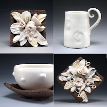
Friday .... unloaded the 04 firing to somewhat better results than the cone 6. The first layer had my colour tests of the Duncan 'Cover Coat' glazes. My first reaction was "wow, these are really matte glazes, how odd". I had the same matte result for the "grey" glazes on the black clay and white earthenware. It is always hindsight that reminds you of the things you could have done in your testing that would have yielded even more information. In this case, that perhaps putting a stroke of clear glaze over the colours would have given an indication of how they stand up to overlapping etc. This was even more true when I returned to the studio to examine the bottles of 'glaze'. Turns out, they are not glaze at all. In very fine printing at the bottom it says opaque underglaze. Oops, no wonder. When I further read the back it said to brush three coats on and then cover with a clear coat. More oops. So, now I have a variety of colours of underglazes which is totally fine as I don't have coloured glazes in my studio. My students will like these too. Now I need to test how they stand up in Cone 6. Further layers into the firing my image transfer tests were revealed. The image was clearer! So, it looks like the final firing of my tile will be 04 afterall. In the photo you can see I brushed on some diluted rutile and red iron oxide on and grey underglaze. The rutile gave the image an aged paper look which might work for my final piece. I slipped in a couple of other tests where I laser printed images onto special decal paper I bought at a model car/train/airplane store very close to home. Artists who have experimented with decal transfers recommended getting it from beldecal.com however I was concerned about timing since it needs to be purchased and shipped from the United States, so I thought I would try this out - and it worked!
I put the transfers onto already fully glazed and fired cone 6 cups and fired them in the 04. Again the result was faded, so I might try doing this at a lower temperature such as 012 as other artists have done. In the late afternoon I took a trip into Dundas to take some clay pressings to give me some different textures for my tile. One of my stops was Grove Ceremony where a memorial is built and a number of the Bertrams are buried. As I bent down to clean off some of the stones laid in the ground so I could read them, there were a number of times where I heard something over my shoulder and felt a presence. I think the Bertrams like that I am interested in their family history and am recognizing it in this way and were were visiting me in this sacred place to let me know so. I have started to feel like their history and lives have become a part of me. It is something unexpected in this process but very special. My clay molds are drying and my next steps are firing these molds, maybe another round of tests of the grey glazes while I commence making the frames of the tile pieces.
But, there will be a slight pause while Robert and I head up to Awenda Provincial Park for 4 glorious days of camping with my friends Kristin and Sue and their families - our 2nd annual trip together. This photo of Ceil and I on a rock on the beach at sunset probably 3 years ago, just gives that sense of peace we have there. I'll post more when I return.

Friday, August 22, 2008

The results

Wednesday ... results day .... I peeked into the kiln in the morning to some disappointment seeing that what had been crisp iron images transferred onto the clay in the bisque, turned into a much faded version. I grabbed a hot tile as my "show and tell" and headed to the Dundas Museum and Archives to spend the day immersing myself once again in the the archival documents and artifacts of the Bertram family. My new friends at the museum were thrilled with my test tile that had a faint but recognizable image of an old advertisement for Canada Tool Works. Perhaps a faded image might be okay for the purposes of this tile. The idea behind archiving is to preserve our past, however sometimes the documents themselves fade away despite all the careful preserving and sometimes by the time the archives receive them, they have already degraded .... something to consider. It is hard sometimes when you have an idea of what something is going to look like and then it is different. I then spent the day re-photographing a myriad of documents, photos and artifacts including this charming photo of the Bertram "boys" lined up by height.
I just loved going through and reading all of the old hand written invoices dating as early as 1871. I could have spent hours reading these things. I came home and unloaded the rest of the kiln. The results were disappointing, particularly what were supposed to be grey test tiles for the frame of the final tile which were a terrible blue colour. There were some interesting results including the low fire grey glazes on the black clay (fired to cone 6) which gave some interesting textured surfaces in a pale yellow, pale blue and pale peach that would make interesting surfaces on decorative pieces (see below). .So now I am waiting for the 04 firing to cool and see if the image transfers at a lower temperature remained darker. So far I have been able to peek in the kiln but the top shelf has test tiles with all the Duncan coloured glazes I purchased which to my surprise are matte. But, there appears to be a few nice grey ones, so my final tile just may very well be all low fire perhaps with some porcelain thrown in for good measure.

Tuesday, August 19, 2008

Image Transfer onto Clay

Opening a kiln continues to be like Christmas to me. Even when it is an ordinary firing I usually sneak in a little test or something a little different that keeps me interested. This morning I opened the kiln to see the first results of my 08 bisque firing of some image transfer tests I am doing for my Hands on History tile. My first glance into the kiln was of the test tiles with the inkjet transfers on them. All that is left is some clay and talc residue from the paper. The result were better as the lower layers of the kiln were revealed. Here are all the tiles out on my table. I tested 3 white clays, PSH 400 (an 04 white earthenware)on the far left, PSH 910 (porcelaneous cone 6) in the center, and Laguna Frost (cone 6 porcelain)on the right. I printed the images in 4 ways - on an HP inkjet at home, on a laser printer and a photocopier at Robert's work,and on a photocopier at the Big Bear near my house. The key to photo transfer is iron in the toner or the ink for the printer or photocopier. This is the case if you use regular paper on a printer or special decal paper. As can be seen from the photo there was a range from no image to a darkish red image left. The darkest image was on the tests where I used the laser printed images. The ink jet and the photocopier from Robert's work left no image. The photocopier at the corner store left a pale peach-coloured mark. I was elated to find images on some of the tiles as it can be difficult to find a printer or photocopier with iron in it. The photo on left shows the most interesting tile that came out of the firing. The paper with the image still on it remained intact but smaller. Both examples show how clearly the text is - at least at this stage. For all of these tests, I used images/photos that I would actually use for the final tile. The image on the far left is of one of the annual ribbons that the Bertrams and their staff wore at company picnics. The other is of an advertisement for their first business - Canada Tool Works. Images with text had to be flipped mirror image in Photoshop to read correctly as the paper with the image is applied face down onto the wet clay and rolled vigorously with a rolling pin to adhere it. I put the 04 tiles asside and set up tests for the cone 6 tiles that had an image left on them. My good friend Jane from Sheridan recommended the use of Duncan Concepts Clear Coat Ice Grey in a diluted format to lightly coat the images for the Cone 6 Firing.
I also tested a full-strength and a diluted format of my own cone 6 clear glaze Val Cushings Clear to see how it worked. What you are trying to avoid is having the iron eaten up by the glaze, hence the diluted format. For some of the tiles I diluted commercial underglazes to watercolour consistency and painted them first, followed by a coating of the ice grey. In this image I used chartreuse on the left and honey on the right. I kept detailed notes indicating what I did with the different test tiles. I then loaded them all up and they are firing as I write. This bisque also included the "black" clay tests I talked about in my previous blog for the "frame" of the final tile. The black clay - PSH 540i - turned a deep purple colour at 08. For this Cone 6 firing I tested various commercial gray glazes on top of this clay as well as on blank Laguna Frost and PSH 910 tiles. I also tried my clear and the ice grey glaze on the PSH 910 tiles that had the grey underglaze on them. And so on and so on .... Stay tuned for the results ....


Thursday, August 14, 2008

A day of clay mixing

After a busy year of making I was out of my very special chocolate brown earthenware clay and it was that time again to spend the day mixing up a new batch. After ordering the materials a day in advance, my day began yesterday when I set out about 6am to head to Brantford to pick up my "secret" ingredient for the clay. I then spent a few hours running around with the twins at the park while my sister was at an appointment and finally headed to PSH to pick up the dry materials at about 10am. And then the fun began.

I start with about 400 lbs of dry materials - primarily clays - red art, ball clay and so on. Added to that is about 120 lbs of other materials including colourants, grog and organic matter. This is dry mixed in the industrial mixer. Many of the materials come in 50 lb bags so it is a lot of lifting - from the car to a cart and into the mixer. While I am weighing the materials, my dry reclaim I have saved over the year is slaked down in water and added once all the dry ingredients are in and have been dry mixed thoroughly. > Water is then added slowly while the mixer is running. Once it seems like the proper consistancy has been achieved, the mixer runs for about a half and hour or more switching between the forward and the backward position. This isn't a time for rest ... while this is happening, I am putting the dry materials I didn't use back in the car and preparing for bagging of the materials. I continuously check the clay and add water if required. The clay is mixed wetter than I think I need it as the clay particles continue to absorb water even after it is bagged.

Then it is time to bag. I love the clay when it is freshly mixed - this is the best part of the process. It is very aromatic, a beautiful chocolate colour and has the most wonderful consistency. This is even more tiring than loading the mixer especially near the end when you are scraping the last bits. By this time I need to really pump myself up as it is quite a job. Bags are filled and stacked onto a cart. Before loading the car I clean the mixer and the mixing room. In all I made 27 bags of clay - likely around 20 - 25 lbs a bag - Phew!! They go into the van and then into the studio. Another year of clay begins ....

Tuesday, August 12, 2008

Hands on History - Let the Testing Begin


While spending the summer at outdoor art venues thoughout Ontario, my mind and my sketchbook have been filling with ideas on how my vision for my tile for "Hands on History" was to be realized. I am one of 8 artists selected to create a ceramic "tile" influenced and inspired by the holdings of the Archives of Ontario. After conducting research at the Dundas Museum and Archives, I decided to select a number of archival documents and artifacts from the Bertram family to use as an an inspiration for this piece that will be on permanent installation at the Archives at York University. The history of this family is etched into the history of the Dundas and this idea of etching is an important metaphor that I will incorporate into the final design. In these photos I am testing out clays and slips to make the frame of the tile that will resemble a Hollinger box - a special archival box used to store papers, maps and small items. I am already seeing how this creative testing will find its way into my regular work .... stay tuned.

My first blog


Encouraged by fellow blogger, amazing artist and good friend Lesley McInally (www.lesleymcinally.blogspot.com), I am entering the world of blogging. I hope you enjoy the ride.