
Wednesday ... results day .... I peeked into the kiln in the morning to some disappointment seeing that what had been crisp iron images transferred onto the clay in the bisque, turned into a much faded version. I grabbed a hot tile as my "show and tell" and headed to the Dundas Museum and Archives to spend the day immersing myself once again in the the archival documents and artifacts of the Bertram family. My new friends at the museum were thrilled with my test tile that had a faint but recognizable image of an old advertisement for Canada Tool Works. Perhaps a faded image might be okay for the purposes of this tile. The idea behind archiving is to preserve our past, however sometimes the documents themselves fade away despite all the careful preserving and sometimes by the time the archives receive them, they have already degraded .... something to consider. It is hard sometimes when you have an idea of what something is going to look like and then it is different. I then spent the day re-photographing a myriad of documents, photos and artifacts including this charming photo of the Bertram "boys" lined up by height.

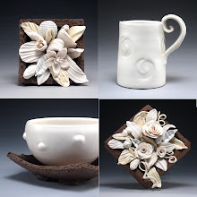
I just loved going through and reading all of the old hand written invoices dating as early as 1871. I could have spent hours reading these things. I came home and unloaded the rest of the kiln. The results were disappointing, particularly what were supposed to be grey test tiles for the frame of the final tile which were a terrible blue colour. There were some interesting results including the low fire grey glazes on the black clay (fired to cone 6) which gave some interesting textured surfaces in a pale yellow, pale blue and pale peach that would make interesting surfaces on decorative pieces (see below). .

So now I am waiting for the 04 firing to cool and see if the image transfers at a lower temperature remained darker. So far I have been able to peek in the kiln but the top shelf has test tiles with all the Duncan coloured glazes I purchased which to my surprise are matte. But, there appears to be a few nice grey ones, so my final tile just may very well be all low fire perhaps with some porcelain thrown in for good measure.

 Wednesday ... results day .... I peeked into the kiln in the morning to some disappointment seeing that what had been crisp iron images transferred onto the clay in the bisque, turned into a much faded version. I grabbed a hot tile as my "show and tell" and headed to the Dundas Museum and Archives to spend the day immersing myself once again in the the archival documents and artifacts of the Bertram family. My new friends at the museum were thrilled with my test tile that had a faint but recognizable image of an old advertisement for Canada Tool Works. Perhaps a faded image might be okay for the purposes of this tile. The idea behind archiving is to preserve our past, however sometimes the documents themselves fade away despite all the careful preserving and sometimes by the time the archives receive them, they have already degraded .... something to consider. It is hard sometimes when you have an idea of what something is going to look like and then it is different. I then spent the day re-photographing a myriad of documents, photos and artifacts including this charming photo of the Bertram "boys" lined up by height.
 I just loved going through and reading all of the old hand written invoices dating as early as 1871. I could have spent hours reading these things. I came home and unloaded the rest of the kiln. The results were disappointing, particularly what were supposed to be grey test tiles for the frame of the final tile which were a terrible blue colour. There were some interesting results including the low fire grey glazes on the black clay (fired to cone 6) which gave some interesting textured surfaces in a pale yellow, pale blue and pale peach that would make interesting surfaces on decorative pieces (see below). .
 So now I am waiting for the 04 firing to cool and see if the image transfers at a lower temperature remained darker. So far I have been able to peek in the kiln but the top shelf has test tiles with all the Duncan coloured glazes I purchased which to my surprise are matte. But, there appears to be a few nice grey ones, so my final tile just may very well be all low fire perhaps with some porcelain thrown in for good measure.


1 comment:
Post a Comment